Research
Research

Nexa is a location-aware digital wallet concept I designed end-to-end, from user research and competitive analysis to wireframes, hi-fidelity screens, and user testing.
Project
Nexa
Timeline
Apr. — May. 2026
Role
UX Research, UI Design, Prototyping, User Testing

Project overview
Digital wallets digitized our cards but never reimagined the experience. Nexa is a concept digital wallet designed to be proactive, not passive. Using location-aware technology, it surfaces the right card, coupon, or stored value at exactly the right moment so users stop leaving money on the table.
Digital wallets digitized our cards but never reimagined the experience. Nexa is a concept digital wallet designed to be proactive, not passive. Using location-aware technology, it surfaces the right card, coupon, or stored value at exactly the right moment so users stop leaving money on the table.

Problem
Most digital wallets are just a digital version of the same cluttered physical wallet. No prompts, no recommendations, no awareness of where you are or what you could save. Money gets left on the table every single day.
Most digital wallets are just a digital version of the same cluttered physical wallet. No prompts, no recommendations, no awareness of where you are or what you could save. Money gets left on the table every single day.
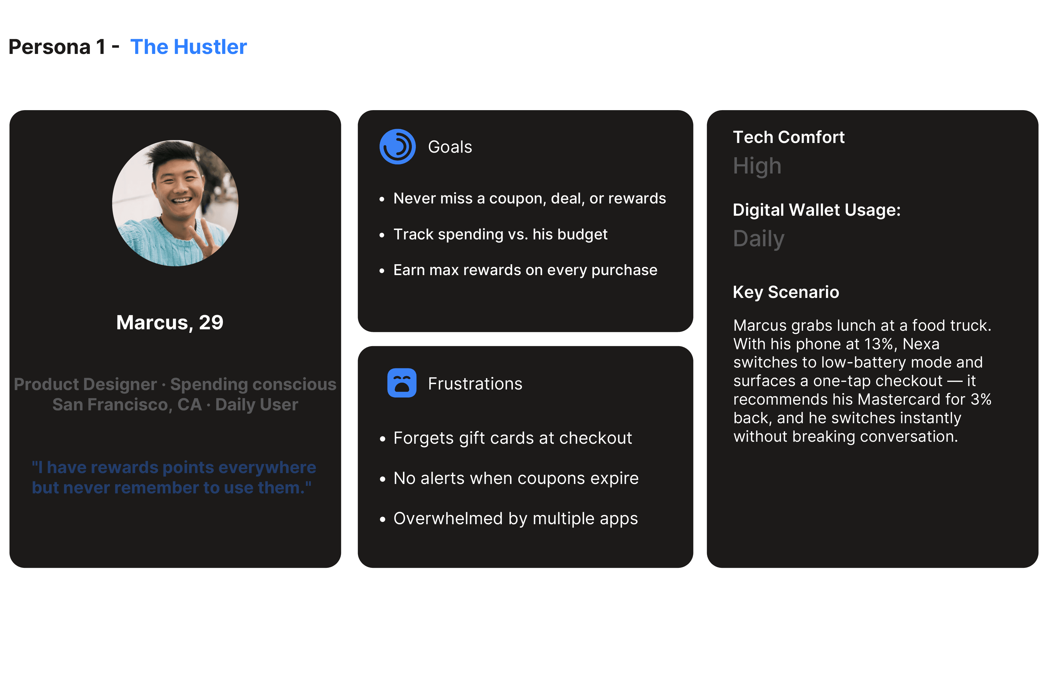
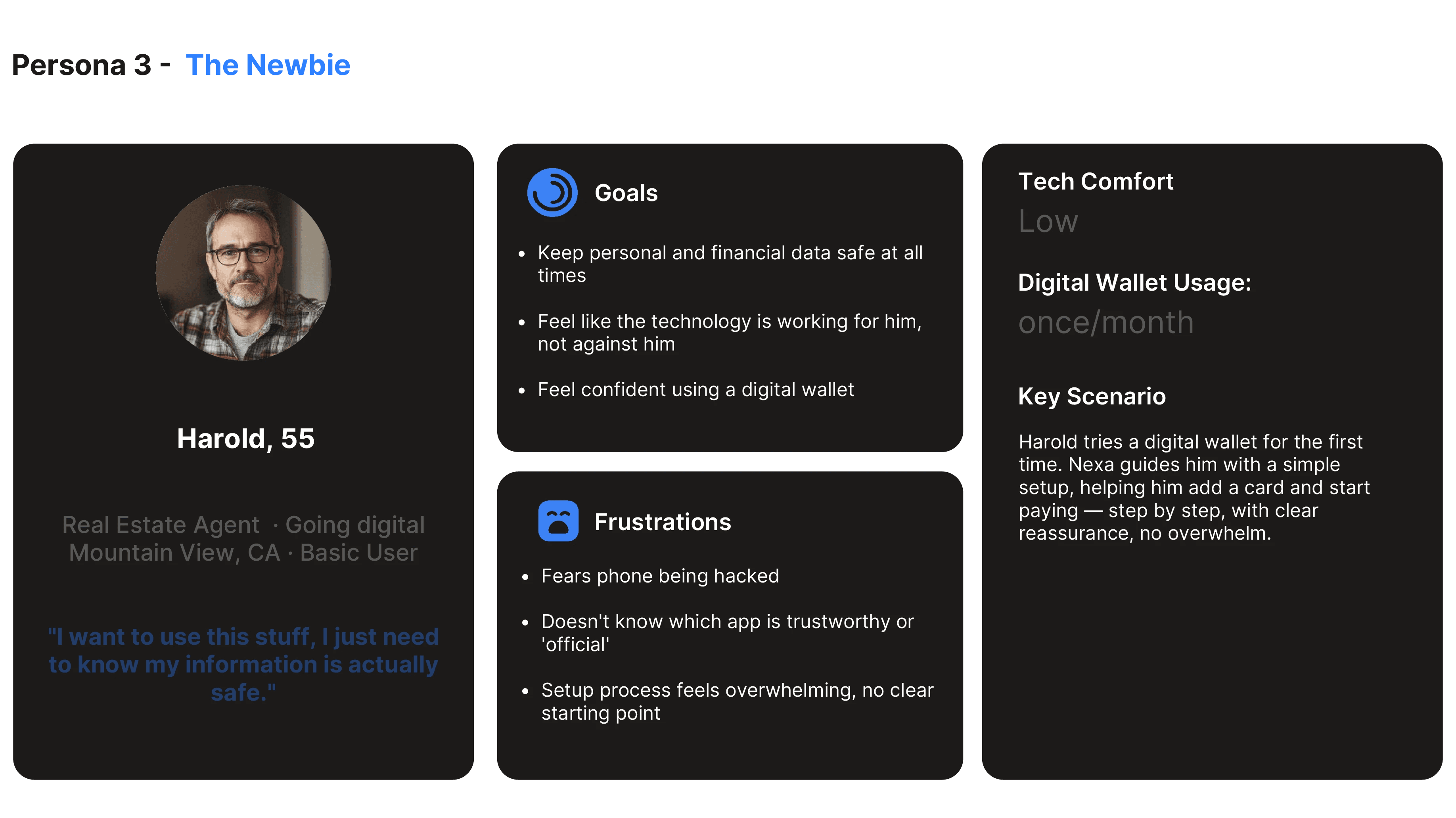
Research & User Personas
Research & User Personas


Lo-Fi Concepts
Lo-Fi Concepts
Primary Task Flow
Primary flow: User arrives near a store → Nexa surfaces relevant card/coupon → User pays
Primary flow: User arrives near a store → Nexa surfaces relevant card/coupon → User pays

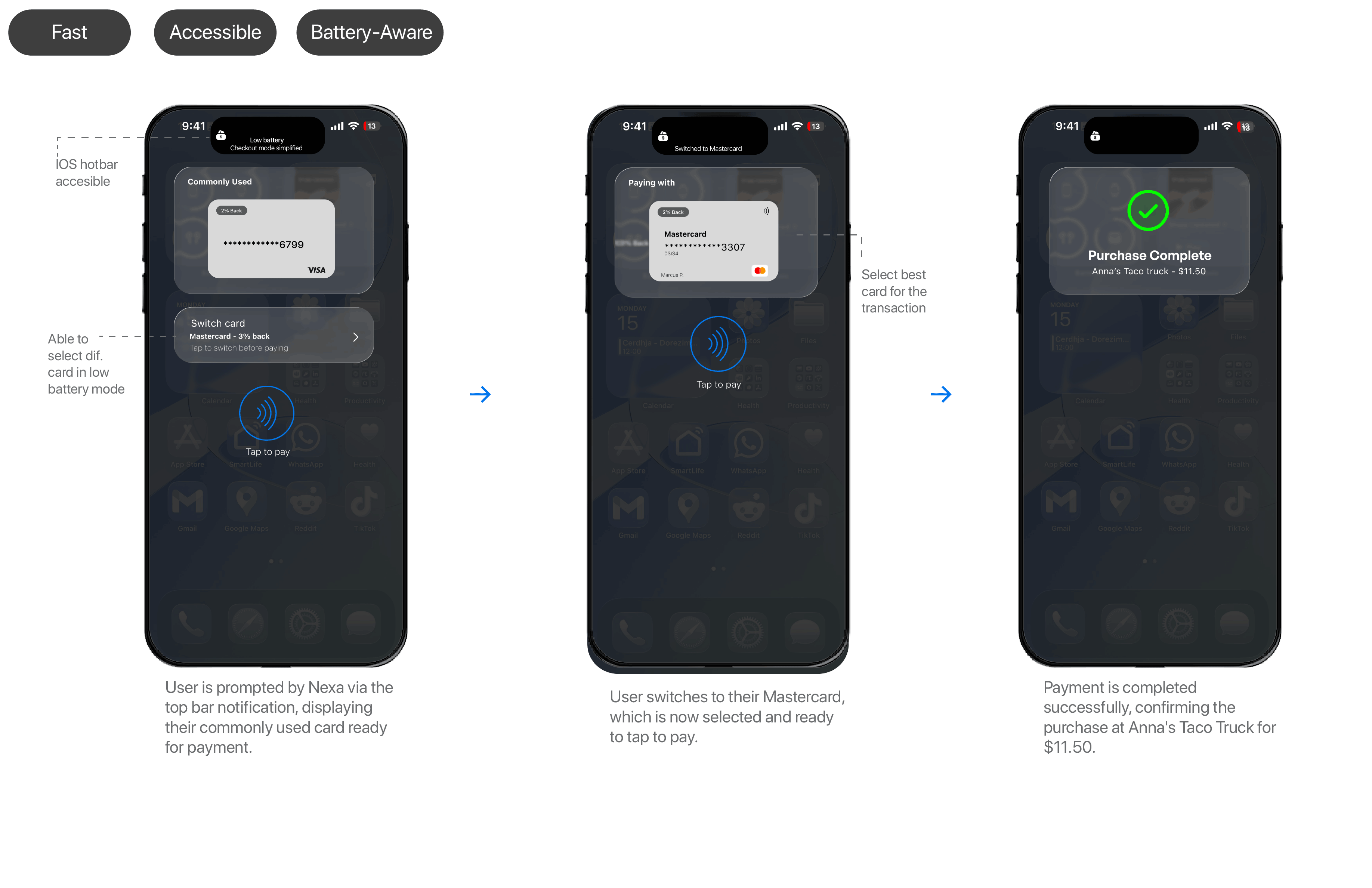
Secondary Task Flow
Secondary flow: User has low battery → Nexa can be accessed through top bar → User selects payment option
Secondary flow: User has low battery → Nexa can be accessed through top bar → User selects payment option
Third Task Flow
Onboarding flow: New user opens Nexa → guided through setup → adds first card → wallet ready to use
Onboarding flow: New user opens Nexa → guided through setup → adds first card → wallet ready to use
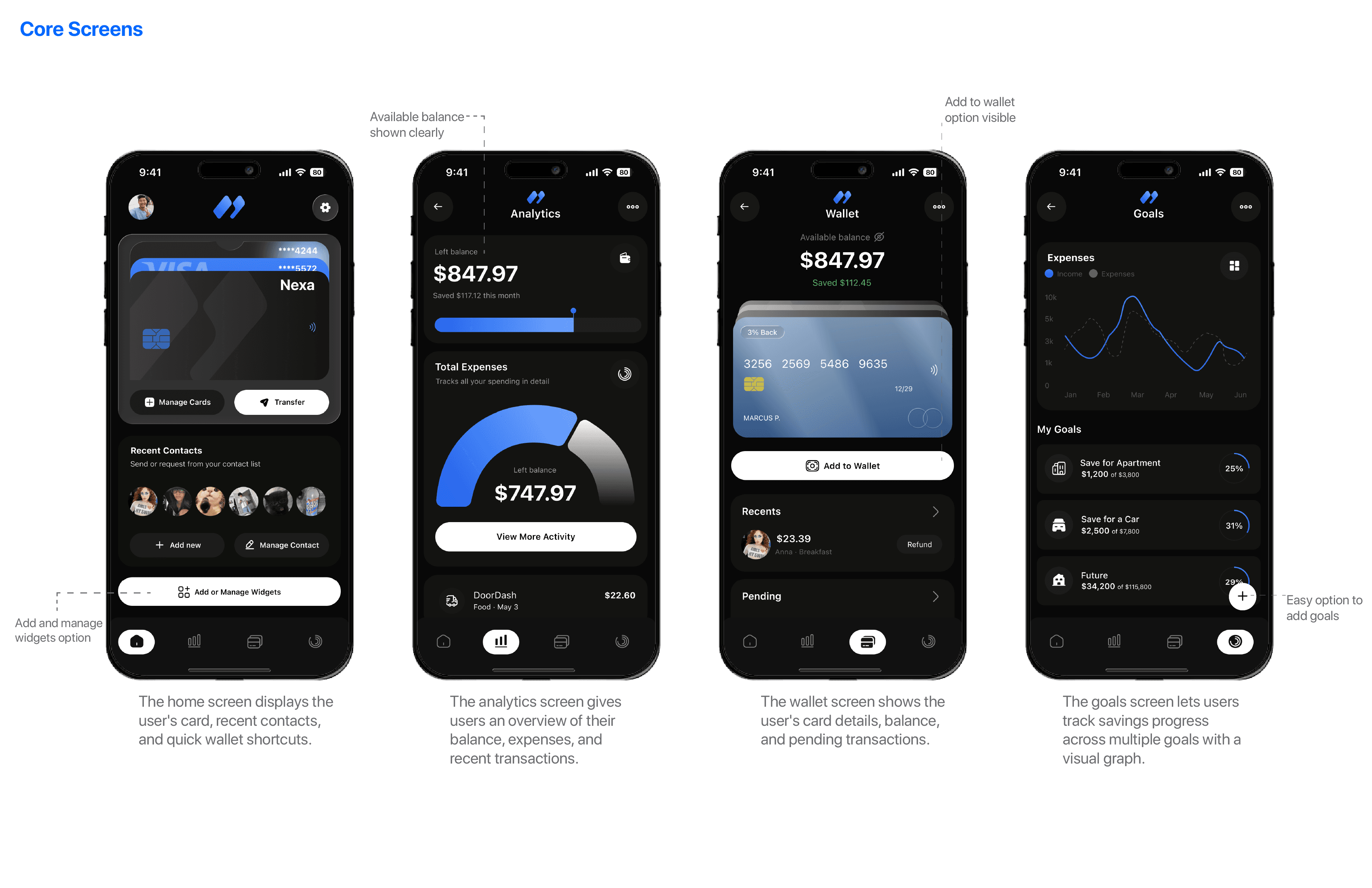
High fidelity
With the flows validated, I moved into high fidelity, refining the visual language, interactions, and details that bring Nexa to life.
With the flows validated, I moved into high fidelity, refining the visual language, interactions, and details that bring Nexa to life.


High fidelity
With the flows validated, I moved into high fidelity, refining the visual language, interactions, and details that bring Nexa to life.
With the flows validated, I moved into high fidelity, refining the visual language, interactions, and details that bring Nexa to life.


Personalization Feature
Giving the digital wallet the personal identity a physical one always had
Giving the digital wallet the personal identity a physical one always had
User Goals, Solved
Coming full circle, here's how Nexa's final design answers the goals of each user we set out to help.
Coming full circle, here's how Nexa's final design answers the goals of each user we set out to help.
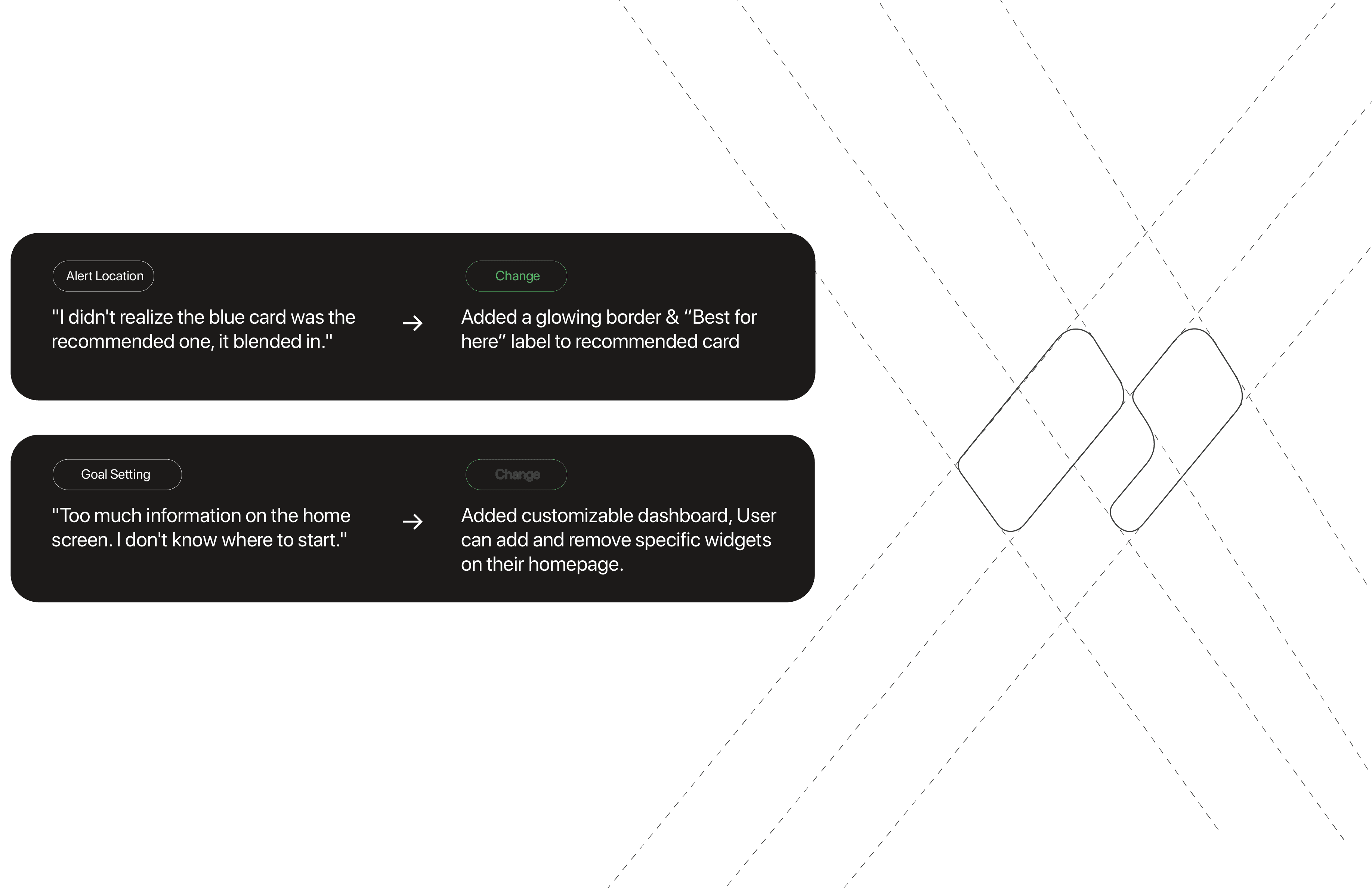
Testing & Findings
Three rounds of testing with four users revealed what was working and what wasn't. Here's what I changed.

Testing & Findings
Three rounds of testing with four users revealed what was working and what wasn't. Here's what I changed.
Project Reflection
Nexa pushed me to think about financial products in a completely new way. What started as a question about why digital wallets feel so passive turned into a deep dive on how people actually manage their money day to day. Conducting user interviews and surveys taught me that the real problem wasn't a lack of features, it was a lack of intelligence. Users weren't careless, their tools just never helped them at the moment it mattered.
Grounding the design in research changed how I made decisions. Instead of guessing, I let real friction guide the product, from the location-aware card recommendations to the customizable dashboard that came directly out of testing feedback. Watching users struggle with an overwhelming home screen, then seeing that same screen click once I added personalization, showed me the value of testing early and often.
If I took Nexa further, I'd keep leaning into the proactive, context-aware direction that sets it apart. This project reminded me that good design isn't about adding more, it's about surfacing the right thing at the right time, and trusting research to tell you what that is.
Personas
Latest projects

Latest projects


Research
Research
Nexa is a location-aware digital wallet concept I designed end-to-end, from user research and competitive analysis to wireframes, hi-fidelity screens, and user testing.
Project
Nexa
Timeline
Apr. — May. 2026
Role
UX Research, UI Design, Prototyping, User Testing
Project overview
Digital wallets digitized our cards but never reimagined the experience. Nexa is a concept digital wallet designed to be proactive, not passive. Using location-aware technology, it surfaces the right card, coupon, or stored value at exactly the right moment so users stop leaving money on the table.
Digital wallets digitized our cards but never reimagined the experience. Nexa is a concept digital wallet designed to be proactive, not passive. Using location-aware technology, it surfaces the right card, coupon, or stored value at exactly the right moment so users stop leaving money on the table.
Problem
Most digital wallets are just a digital version of the same cluttered physical wallet. No prompts, no recommendations, no awareness of where you are or what you could save. Money gets left on the table every single day.
Most digital wallets are just a digital version of the same cluttered physical wallet. No prompts, no recommendations, no awareness of where you are or what you could save. Money gets left on the table every single day.
Research & User Personas
Research & User Personas
Lo-Fi Concepts
Lo-Fi Concepts
Primary Task Flow
Primary flow: User arrives near a store → Nexa surfaces relevant card/coupon → User pays
Primary flow: User arrives near a store → Nexa surfaces relevant card/coupon → User pays
Secondary Task Flow
Secondary flow: User has low battery → Nexa can be accessed through top bar → User selects payment option
Secondary flow: User has low battery → Nexa can be accessed through top bar → User selects payment option
Third Task Flow
Onboarding flow: New user opens Nexa → guided through setup → adds first card → wallet ready to use
Onboarding flow: New user opens Nexa → guided through setup → adds first card → wallet ready to use
High fidelity
With the flows validated, I moved into high fidelity, refining the visual language, interactions, and details that bring Nexa to life.
With the flows validated, I moved into high fidelity, refining the visual language, interactions, and details that bring Nexa to life.
High fidelity
With the flows validated, I moved into high fidelity, refining the visual language, interactions, and details that bring Nexa to life.
With the flows validated, I moved into high fidelity, refining the visual language, interactions, and details that bring Nexa to life.
Personalization Feature
Giving the digital wallet the personal identity a physical one always had
Giving the digital wallet the personal identity a physical one always had
User Goals, Solved
Coming full circle, here's how Nexa's final design answers the goals of each user we set out to help.
Coming full circle, here's how Nexa's final design answers the goals of each user we set out to help.
Testing & Findings
Three rounds of testing with four users revealed what was working and what wasn't. Here's what I changed.
Testing & Findings
Three rounds of testing with four users revealed what was working and what wasn't. Here's what I changed.
Project Reflection
Nexa pushed me to think about financial products in a completely new way. What started as a question about why digital wallets feel so passive turned into a deep dive on how people actually manage their money day to day. Conducting user interviews and surveys taught me that the real problem wasn't a lack of features, it was a lack of intelligence. Users weren't careless, their tools just never helped them at the moment it mattered.
Grounding the design in research changed how I made decisions. Instead of guessing, I let real friction guide the product, from the location-aware card recommendations to the customizable dashboard that came directly out of testing feedback. Watching users struggle with an overwhelming home screen, then seeing that same screen click once I added personalization, showed me the value of testing early and often.
If I took Nexa further, I'd keep leaning into the proactive, context-aware direction that sets it apart. This project reminded me that good design isn't about adding more, it's about surfacing the right thing at the right time, and trusting research to tell you what that is.
Personas
Latest projects
Latest projects