Built from pixels. A complete brand identity for the Consumer Technology Association, the people behind CES
Company
CTA
Timeline
Feb. — May 2025
Feb. — May 2025
Role
Brand Identity, Web Design, Product, Motion
Built from pixels. A complete brand identity for the Consumer Technology Association, the people behind CES
Company
CTA
Timeline
Feb. — May 2025
Role
Brand Identity, Web Design, Product, Motion
Project overview
CTA is the Consumer Technology Association, the organization behind CES and the standards that shape the consumer tech industry. This rebrand builds the entire identity system around a single concept: pixels as a representation of technology, and of small pieces coming together to create something bigger.

Logo
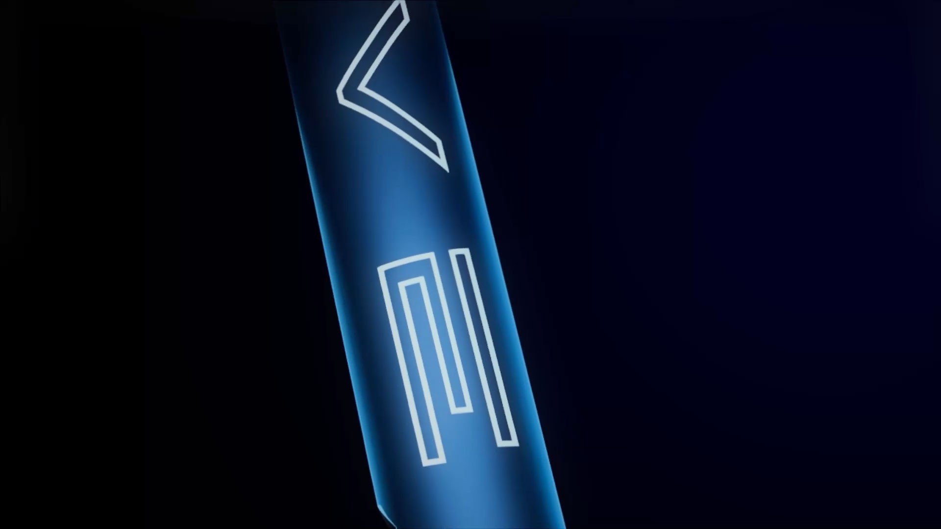
CTA's existing logo leaned on a gradient mark that didn't scale well or carry a clear concept. The redesign strips it back and rebuilds from pixels, forming the CTA letterforms out of pixel blocks that represent technology and connectivity. The result reads as modern and systematic without losing the weight the brand needs


System
The system runs on two primary brand colors supported by a full sub-brand palette, each sub-brand with its own distinct color while staying connected to the whole. A bold geometric sans pairs with a pixel grid that extends into patterns and icons across every vertical.
Web
The homepage brings the full brand system together, while each sub-brand page adapts the color and iconography to its vertical, keeping the family connected without losing individual identity.


Social Campaign
The social campaign extends the brand across formats, using each sub-brand's color and iconography to anchor individual posts while the pixel system and tagline keep everything tied to CTA.


Product Design
The identity extended into a set of six sub-brand coasters, each color-coded and icon-stamped to its vertical, packaged in a branded sleeve.


Project Reflection
This project pushed me to think systematically about brand identity, not just designing a logo but building a language that could scale across web, social, print, and motion. The pixel concept gave every decision a clear filter: if it didn't fit the system, it didn't belong.
That kind of constraint ended up being more freeing than limiting. If I were to take this further, I'd develop more sub-brand applications and explore how the motion language could extend into UI and product experiences.
Latest projects

Latest projects

Built from pixels. A complete brand identity for the Consumer Technology Association, the people behind CES
Company
CTA
Timeline
Feb. — May 2025
Feb. — May 2025
Role
Brand Identity, Web Design, Product, Motion
Built from pixels. A complete brand identity for the Consumer Technology Association, the people behind CES
Company
CTA
Timeline
Feb. — May 2025
Role
Brand Identity, Web Design, Product, Motion
Project overview
CTA is the Consumer Technology Association, the organization behind CES and the standards that shape the consumer tech industry. This rebrand builds the entire identity system around a single concept: pixels as a representation of technology, and of small pieces coming together to create something bigger.
Logo
CTA's existing logo leaned on a gradient mark that didn't scale well or carry a clear concept. The redesign strips it back and rebuilds from pixels, forming the CTA letterforms out of pixel blocks that represent technology and connectivity. The result reads as modern and systematic without losing the weight the brand needs
System
The system runs on two primary brand colors supported by a full sub-brand palette, each sub-brand with its own distinct color while staying connected to the whole. A bold geometric sans pairs with a pixel grid that extends into patterns and icons across every vertical.
Web
The homepage brings the full brand system together, while each sub-brand page adapts the color and iconography to its vertical, keeping the family connected without losing individual identity.
Social Campaign
The social campaign extends the brand across formats, using each sub-brand's color and iconography to anchor individual posts while the pixel system and tagline keep everything tied to CTA.
Product Design
The identity extended into a set of six sub-brand coasters, each color-coded and icon-stamped to its vertical, packaged in a branded sleeve.
Project Reflection
This project pushed me to think systematically about brand identity, not just designing a logo but building a language that could scale across web, social, print, and motion. The pixel concept gave every decision a clear filter: if it didn't fit the system, it didn't belong.
That kind of constraint ended up being more freeing than limiting. If I were to take this further, I'd develop more sub-brand applications and explore how the motion language could extend into UI and product experiences.
Latest projects
Latest projects